Tuesday 29 September 2015

R29 - Film Poster Analysis - Drag Me To Hell


This film poster is heavily reliant on Photoshop as it has several different images layered into one e.g. The girl, the hands, the houses in the background and then the fire at the front. The girl is seen in an eye level mid shot of her trying escape the hands dragging her down. The hands holding onto her, have claws, implying that they're monsters or something from the underworld 'trying to drag her back down to hell'. 

The main title is in white which stands out against the darker colours in the background. The text above the title gives the audience an insight into what the film is about and the girl in the poster. The sub text of the production companies are all in orange and a thin font which makes it slightly visible to see if the audience were to go closer to see. Also, the addition of a website allows the audience to access more information if they wish which also increases publicity and markets the film as well.

The darker background colours are more focused towards the edges of the poster as opposed to the middle where the lighting is focused on the girl and the hands clawing her down. The lighting is effective as it solely focuses on the central image, showing a girl screaming. Her expressions present the emotions of fear and panic, illustrating to the audience her pain. Without this lighting, it wouldn't make the image stand out as much, making it much less effective for them. Despite this, the houses in the background may be less focused on as the lighting hardly touches it, but it is still visible. 

This poster conforms to the horror genre, as the colours are quite dark, and there is one character (the main character) connoting that they are trying to get away from something, which is typically seen in a horror film. It targets the audience as it gives an insight into what the film is about and the type of characters within the film. Overall the image presents a sense of tension as the girl seems to be unable to move due to whatever is dragging her down, and I personally think that the poster is effective for the audience as it seems to include a variety of things.  

Tuesday 22 September 2015

R27 - Camera Composition Rules

For two 50 minute lessons, a fellow teacher came in and taught the class how to use the Canon EOS 100D DSLR camera to help with our filming. He gave a variety of tips and help on how to correct the setting, the use of the tripod, etc. 


The Three Main Aesthetic Rules
Firstly, he spoke about the positioning of a person within the shot. These are the three main aesthetic rules. They are:


1. Rule of thirds: a rule stating that an image can be split into 9 equal parts by two equally spaced horizontal and vertical lines. The intersected points can align the features of the image. This helps add to the effect of the photo.

2. Lead room: The space in front/in the direction of a moving/stationary object. For example a car requires a lead room. When there is extra space at the front of the car, the person can see that there is some place to go. 

3. Head room: Refers specifically to the distance between the top of the subject's head and the top of the frame. The amount of the frame filled by the subject should always have room for the head. However this varies as the camera can zoom in and out, but should continuously keep the subject as the centre of interest. 
White Balance 
He also taught us the importance of white balance when taking a picture or video. In order to change the white balance, he showed us on the camera how to change the setting and gave us examples on what colours would counteract the colour in the frame. This can be seen in this video:

Depth of Field
The depth of field helps signify what and who and what is most important in the frame as it emphasises on the subject more. He showed the difference between a smaller depth of field compared to a greater depth of field and gave us an example using our own hand. 

Rule of 180 & 30 degree
The rule of 180 is where the cameras are positioned and that it cannot pass 180 degrees. If this does occur, then it will give the impression that the characters have switched sides.
In interviews, 30 degree angles are generally used when the subject is in the frame. This positioning allows the audience to see their perspective without actually have them talking to them. Similarly, between two shots, it is recommended  to move the camera at 30 degrees. Otherwise the viewer will have the impression that the image jumps. 

Breaking the Rule of 180 & 30
However some famous directors defy this rule and use whatever angle they want. For example in the next clip, Stanley Kubrick, director of The Shining (1990) breaks the rule of 180. 


 Likewise, Quenton Tarantino also does this in many of his films such as Pulp Fiction (1994), where the film's structure is constantly swapped and changed. The information is given in an unusual order so that we, the audience, are left to piece the film together ourselves.  

Sunday 20 September 2015

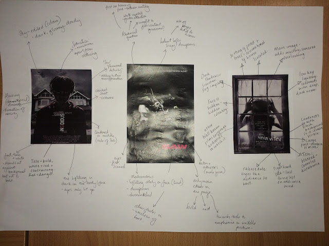
R28 - Poster Analysis: Insidious, Saw & The Uninvited


Here I analysed 3 different posters in which all had a black and white theme which is what we want for our poster idea. All three posters play with lighting to present to add to the effect of their poster which gives us an idea on how to use lighting for our poster. 


Thursday 17 September 2015

R26 - Production Logo


We tried to take inspiration from other horror film production companies however we felt that none of them visibly looked anything like what we wanted to produce. There we started from scratch by using Photoshop. We didn't want our logo to be too heavily detailed, we just wanted it to be something that was simple yet stands out which is why we chose a font for 'SKASA' that was more different to productions as that represents us. 

Saturday 5 September 2015

R24 - Analysis: 'The Visit' Opening Titles & Soundtrack


Like the previous film, this movie also begins opening up from dark with increasingly loud music. The music is conspicuous and begins to become clear that the sound is like the wind howling and things rattling in the wind. The first production company is also Universal as the word 'Universal' mimics the ring of Saturn however coming around Earth. The music become fully loud and the other two production companies are presented: Blinding Edge and Blumhouse productions.

The screen then blacks out and then on screen a small text appears on the right hand of the frame which says 'Universal pictures present'. The sound was quiet however non diegetic sounds of a recorder getting ready to work can be heard.

Then the scene moves onto a clip of a school taken as if nobody knew, and the non diegetic voice says "..at the end of high school, I fell in love with a substitute English teacher". This raises suspicion within to audience to find out whether he loved her back or even how old she was. She then goes on to saying "it was quite a scandal". Whilst she tells the story of her life, she going on to saying how he fell in love with someone else in Starbucks, perhaps suggesting to the audience that she would've got revenge?

The woman presented in the scene looks middle aged, as if she is/was a mother looking back at the memories of her past. She seems to be in the comfort of her own home as she is sitting informally yet the tone of her voice is as though he is serious about this interview. 

She then goes to explain her past about leaving home through diegetic, synchronous sound. She says "the week I left my parents, they cursed at me which was crazy unusual and it ended very badly. I left at 19 and I havent seen my parents in 15 years". 

However whilst the camera focuses on her, it shifts to a different cut and angle where the frame when she is sitting shows her, however when it cuts, the camera captures her through a way that is almost as if she doesn't know it on her. It gives the audience the impression of 'behind the scenes' as opposed to what she is presenting herself to be.


This opposes the character she plays previously as this one is more raw. When looking at it, the audience do not automatically think she is a mother, but she looks more like a high school student who hasn't escaped her past. 

The non diegetic voice over continues to say "they looked me up on the internet, and asked to spend a week with their grandchildren... they have a counselling website, people love 'em... I told the kids, they said they wanted to go, I didn't want them to and they wanted to go anyway". This suggests that there is still some tension between her and her parents as when she says 'people love em', it is almost as if people shouldn't love them, because they're not what they seem. Her facial expressions give the idea that this isn't the first time she's heard it so it bothers her. 

The last thing you hear before the titles come up is a younger girl's voice saying "describe the events which you left your parents farm when you were 19". The setting of a farm is conventional in a horror story therefore it could connote that the grand parents are actually the main 'horror' of the story. 


The screen cuts to black and 'The Visit' appears in red which appears larger. Sharp sounds can be heard and almost a faint humming sound.